5 Remarkable Architectural Projects with Colors
Why Designing Architectural Projects with Exceptional Colors
The colors used in the various designs of architectural projects and construction do not necessarily mean only bright colors, but all the pale and clear hues, in addition to the natural colors of the materials and coatings themselves.
So, normally any construction isn't just a monochromic structure, but the color is a related and natural part of the building. Colors are economical-in-space design tools, as they don’t need a lot of size extension within the building area.
They are either part of the materials' nature or the coating layer's thickness, which does not exceed a few millimeters. They are DIY home improvement projects, and easy to implement because there are a lot of paint coatings that can be implemented by ordinary people, and they are low in price when compared to other different expensive materials and methods.
 |
| Fig.1- Water Park Playground is an ideal example where Colors are used to the fullest as a symbol of joyfulness. Photo Source: makhsoom.com |
➤ Learn more: Read Facts About Using Colors in Architecture and Interior Design; for more information about Designing with Colors and live examples on this topic.
The Importance of Light and Colors in Architecture: The Light and Color Factor
Colors are not found alone in nature but are always under the influence and interaction of other natural elements surrounding them, such as light, dust, and other factors. It also varies in nature; the sky changes its color from white in the morning to blue in the afternoon, then to red at sunset and at the beginning of the night to purple, and then to black at night.
The colors of plants and animals today are precisely what these creatures need for their existence and the continuation of their species, and they send chromatic messages intended to help them hide, camouflage, or warn. A very well-known example of what it precedes is the chameleon.
Colors are also an important part of the visual arts, but designing with colors is somehow a complicated matter because colors interact with light, sight, shapes, shadows and human senses; It is an existing science by itself and have its own rules that many of designers hesitate or worry to handle because their impact varies over individuals from one to another.
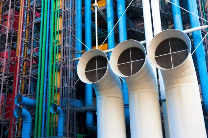
It depends on the mentality and the psyche language of the people or the society behind them to understand and react to it; George Pompidou Cultural Center and Museum in Paris by Renzo Piano, Richard Rogers, and Gianfranco Franchini is a typical model of integrating colors in Architectural Design. (See Photo Credit: www.legorafi.fr)
Therefore the use of colors in buildings in general needs specific scientific knowledge and extensive practical experience, and it must be taken into account from the beginning if we want the design to succeed. This thing drives designers to hire some specialists in color design and methods of use, which raises the cost of design significantly, which makes its use dominated by large and big projects only.
How to use Colors in Architecture?
Assuming the varieties in nature serve the guiding goals important for the coherence of life advancement, then, at that point, for the assembled climate they serve the directing objectives that stream from the improvement of culture and its variety as per every general public.Colors in urban areas and structures, and inside them, as well as the shades of items and works of art, carry out roles that add to the existence of their networks. At first, the various sources were neighborhoods, which prompted the making of a nearby variety code for every local area. This guideline permits coordinating, communicating implications, and recognizing the nearby personality.
With the improvement of industry, methods for transportation, and present-day correspondence, the creation of building materials, remembering painting and coatings for huge amounts, unification, replication, and simplicity of dispersion. A condition that debilitated the neighborhood characters, and in this manner, it was important to track down better approaches to protect them, subsequently the significance of varieties today as they are a strong plan device fit for communicating and impacting Humanity.
Usage of Colors in Architectural Projects
In the modern era, some architects excelled in the use of colors such as the Mexican Luis Burgan (1902 - 1988) and Ricardo Liguria (1931 – 2011), the American Frank Gehry (1929), the French Jean Nouvel (1945) and the Dutchman Ben Van Barkell (1957) and many others...However, in this post, we will discuss the role of colors in architectural projects and their use in an appropriate artistic and scientific manner in terms of:
- First: The Color Functionality
- Second: A brief history of its usage in the construction industry
- Third: A review of 5 contemporary projects as examples of color design.
- First: The Color Functionality
Colors are a phenomenon in the first place and are a medium for vision and communication.
Colors as a phenomenon, constitute the visual feeling of a person with the environment around him; Where, if it can be explained simply, colors are transformed by the eye's retina into energy that creates a chemical light reaction that the person feels and accordingly affects his emotion.
Objects may appear monochromic (white, gray, and black) or chromatic, as the colorless shapes define the formal frame and size and focus on the elements of length, width, depth, and proportions. As for the colors, they distract the eyes from focusing on the shape and size of objects, and therefore the colors become merely decorative items within forms with flat shapes (which have no volume).
Increasing or decreasing the amount of color without knowing, can badly affect the design which leads to misleading the receiver or the normal user. Therefore the use of colors in the design must have specific communication goals. And if the colors in Mother Nature follow the theory of evolution, any change in the balance of these colors prejudices the presence of creatures or forces them to transform.
For example, the color orientation feature of bees by which the color spectrum of the flowers depends on transfer between them, transferring their pollen from one flower to another, without this characteristic 60% of plant species become extinct.
- Second: A brief history of its usage in the construction industry
With the development of archeology in the second half of the eighteenth century, studies and research helped to understand the relationship between colors and construction.
 |
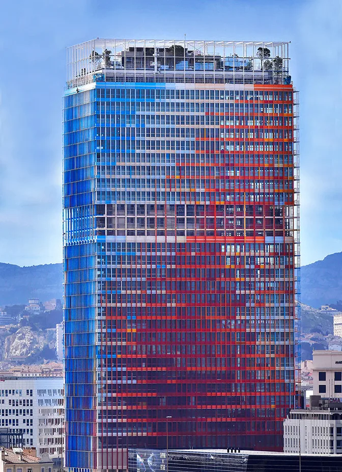
| Fig.3- The Marseille Tower featuring the colors of the French Flag. Photo Credit: fr.wikipedia.org |
It proved that the use of colors in temples and historical Greek sculptural works was every day, as those edifices that still exist were believed to have been constructed with abstract stone surface colors and to be colored later.
A dispute occurred in the nineteenth century between historians about the role of colors in the design of edifices and whether the use of colors in architecture must be by the natural colors of materials or colors may be added to the surface of the material, and due to the German architect Gottfried Sanber, in his writing between 1834 and 1869.
The interpretation of the use of colors inside the walls of Greek temples is inspired by the mounds of huts and primitive tents made of colored textiles (such as carpets) and both represent the external cladding of the building that is decorated with colors.
This theory is still being used architecturally today even though more than a century has passed since then. (See the image above for the tower project in Marseille designed by Jean Nouvel).
- Third: Example of buildings with remarkable colors
As a matter of fact, we will review five related projects in which colors were used as a basis for achieving the project requirements, namely:
1- La Defense Offices building project in Elmira, Netherlands, designed by UNStudio.
 |
| Fig.4- LA DEFENSE Building by UNStudio. Photo Credit: www.unstudio.com |
The design mixes the elements of natural light and colors through the building's glass facades, which are covered with a mixture of colored chips. The color of the destinations changes according to the natural light falling on them throughout the daylight hours.
These variable-looking facades overlook a zigzag inner courtyard connecting the areas between the building and aiming to attract pedestrians to pass through and bring life to its center. The colors here are one of the advantages of the building to attract companies for its rental office space preference. (The aesthetic side serves the commercial side).
2- French International School Project in Hong Kong, China, designed by Henning Larsen Office.
The nature of the buildings that serve young people pushes forward the use of colors as an effect of attraction for these age groups.
 |
| Fig.5- French School in Hong Kong |
Normally they are affected by the colors directly and quickly. In addition, the project uses colors as a guide and definition that creates an atmosphere of reliability and safety for young people and reduces the impact of the concrete glut of Hong Kong city buildings surrounding the area of the project. It is also used by the design to integrate the project into its natural surroundings using colors that harmonize the sky with green areas and soil.
3- Entertainment project in Seoul, Korea by designer office MVRDV.
 |
| Fig.6- Entertainment Project in Seoul, Photo credit: aasarchitecture.com |
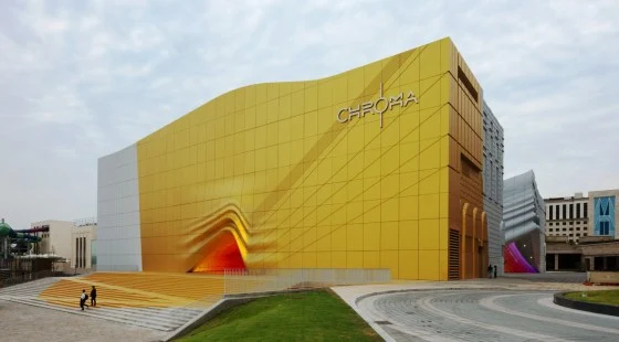
Recreational and entertainment projects always need very attractive architectural designs, which are provided by the concept that combines distinguished decorations and colors that give the external appearance very rich impressions, where gold paint was used.
Golden color always gives a higher value to things than their real value because the buildings are not gold. Here the designer deals with golden color as the clothing that people wear to show off. It is to give an impression of richness and to define the location of the buildings due to their proximity to the city's airport.
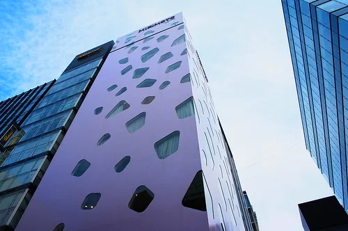
4- Designed by Toyo Ito, an office tower for pearl trading in Tokyo, Japan.
 |
| Fig.7- Office Tower by Toyo Ito. Photo credit: kenchiqoo.net |
Here the designer uses the pearl white color processing story to express the building's concept which is the pearl trade with the color-changing according to daylight hours to pink just as the pearl color is.
5- A project to Breed and Manufacture Fish in Northern Norway, designed by the Snohetta Office.
 |
| Fig.8- The Project was designed by Snohetta Office, Photo credit: architectureadmirers.com |
Similarly, let's look at this colorful project that caught my attention directly and easily, due to its bold saturation; In addition to what precedes, the multiple slides that connect the levels of the building with the ground, which is nothing but a pool of water, gives a dynamic flair to the scene... However, the mixture of those colors together creates a joyful sensation for all the inhabitants and visitors.
I hope this article has inspired you to learn more about color theory in architecture. For more readings about colors in architectural projects learn about all the different factors that come into play.
.png)


