What is the Effect of Colors in Architecture?
Psychological Effects of Color in Architecture
Architecture is a science and should be treated accordingly. The designer’s job aim is, or should be, to work with the clients to find out what they want and to design it based on the architectural rules and conditions, if we can say so.
The effect of colors in architecture needs more attention from the designer; Color can help focus on the most important elements in your concept and project. Let's see how.
When designing a building, you need to consider many factors such as site location, neighboring buildings, terrain, and features, in addition to its structure. All that precedes is mainly the architect’s job and study. For example, why do we use concrete? It's because it's cheap, but its compression strength also helps handle weight from above.
The other designing section, such as the color of the rooms’ paintings or the preferred area occupied by the kitchen, can, on the other hand, be domesticated or customized according to or with the collaboration of the client himself.
 |
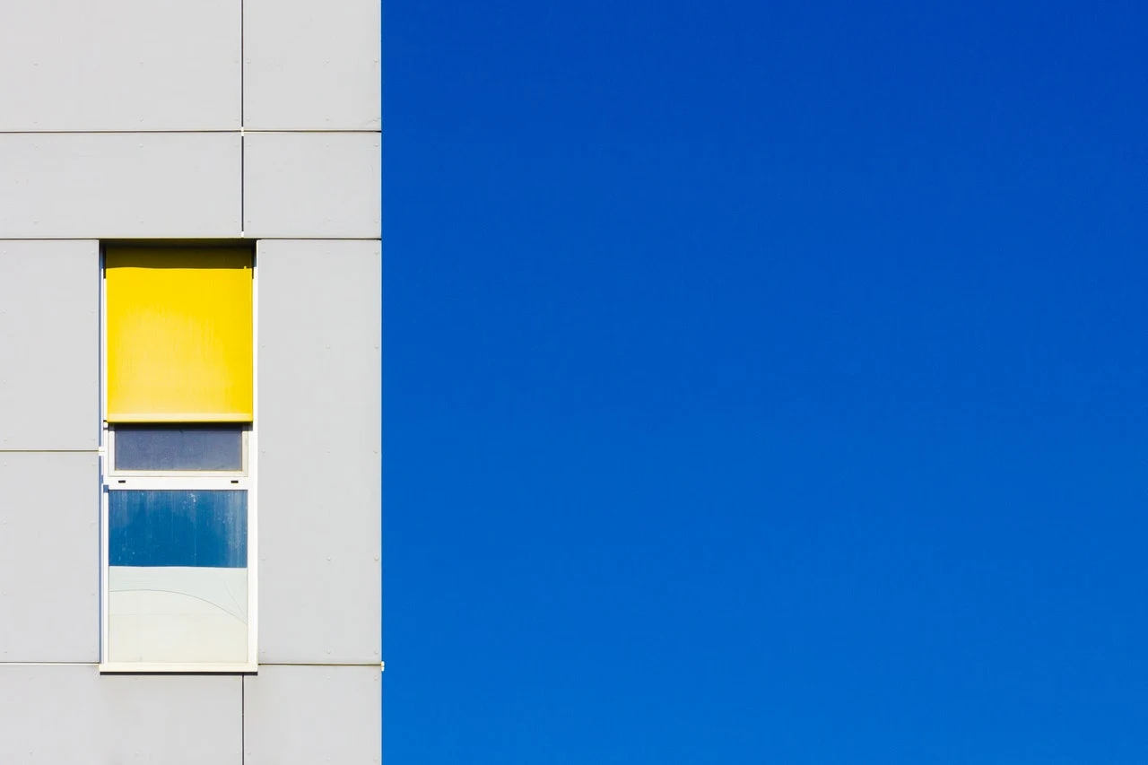
| Blue Illustration for Architectural Colorings, Photo by Uri Espinosa from Pexels |
Good to know that the colors you use in your home can have a dramatic impact on the way you feel. There are many ways to incorporate color into your life, and one of them is with architectural elements.
Understanding how colors affect us can help you choose the right colors for your home.
Color Throughout History
Color has always been an important part of architecture and design. It can help you create a certain atmosphere and make your building look attractive and eye-catching. Next, we will discuss the role of color in architecture from a historical perspective.
create a sense of comfort and a specific mood for the occupants of the house or any sort of construction. It can be utilized to symbolize different soul sensations such as power and wealth, as well as to portray a sense of decision and firmness. It’s also used as a method of social class distinction.
➤ Learn more: Read the article 5 Architectural Projects with Remarkable Colors for more information about designing with Colors and live examples about this topic.
In ancient times, color was limited to the materials that could be found in the natural landscape. Archaeologists have found evidence that Egyptians used natural pigments like red ochre, iron oxide, and charcoal from burnt trees to paint their houses.
Likely, the ancient Greeks and Romans were known for their usage of dyes, which included madder, weld, kermes, woad, walnut hulls, oak galls, saffron, and lichen purple. Except for kermes, where all the remains are no longer available, these were the dyes we used in the construction.
 |
| Multicolored Wooden Houses reveal a joyful feeling for a happy vacation, Photo by Hoàng Chương from Pexels. |
According to Gaius Plinius Secundus, also known as Pliny the Elder, who was a famous Roman Author, orange, red, and purple were the colors worn by priests and clerics. However, purple was always the preferred color for high officials and the clothing of Emperors, which used a dye extracted from the shellfish of a Murex species.
Certain colors have always been associated with certain moods and emotions. In Ancient Rome, for example, yellow was considered a happy color because it symbolized the sun and life. However, in Baghdad precisely, yellow was a melancholy color that represented death.
Similarly, in ancient Egypt, bright colors were used for sorrowful clothes and homes because they were associated with death. Human beings have created art in one form or another since immemorial times. In the prehistoric era, drawings and paintings on cave walls were the main sources of artistic expression. These pictures were not always painted to win over the viewer; They were used to send information and illustrate a message.
Colors show up in architecture around 1500BC, in paintings found in Egyptian tombs, as mentioned above. The colors were chosen with a particular purpose: to give life to the afterlife. It wasn’t until much later that color was used for practical purposes, such as resonating with moods or matching décor.
As civilizations progressed, different techniques were introduced to make art more diverse. For instance, sculptures were developed in the Stone Age, pottery was made in the Bronze Age, and mosaics were made during ancient Roman times.
 |
| First, cave-colored paintings found in Altamira, Photo: chemistryviews.org |
With each passing generation, people became more innovative and imaginative with their art forms. And architecture wasn’t an exception at all; it also progressed along with the evolution of civilization and culture.
Architecture has been using color for thousands of years. Only in the past hundred or so years has it deviated from color to function as the main focus of architecture. It’s important to know how we got to where we are today and why color is more popular than ever.
How does color affect the human psyche?
Colors are powerful, and they affect our mood, emotions, and behavior in one form or another. They can raise your spirits and make you feel happy or calm, as well they can also make you stressed and nervous.
Indeed, color therapy is becoming a popular tool for stress reduction, relaxation, and other therapeutic purposes.
 |
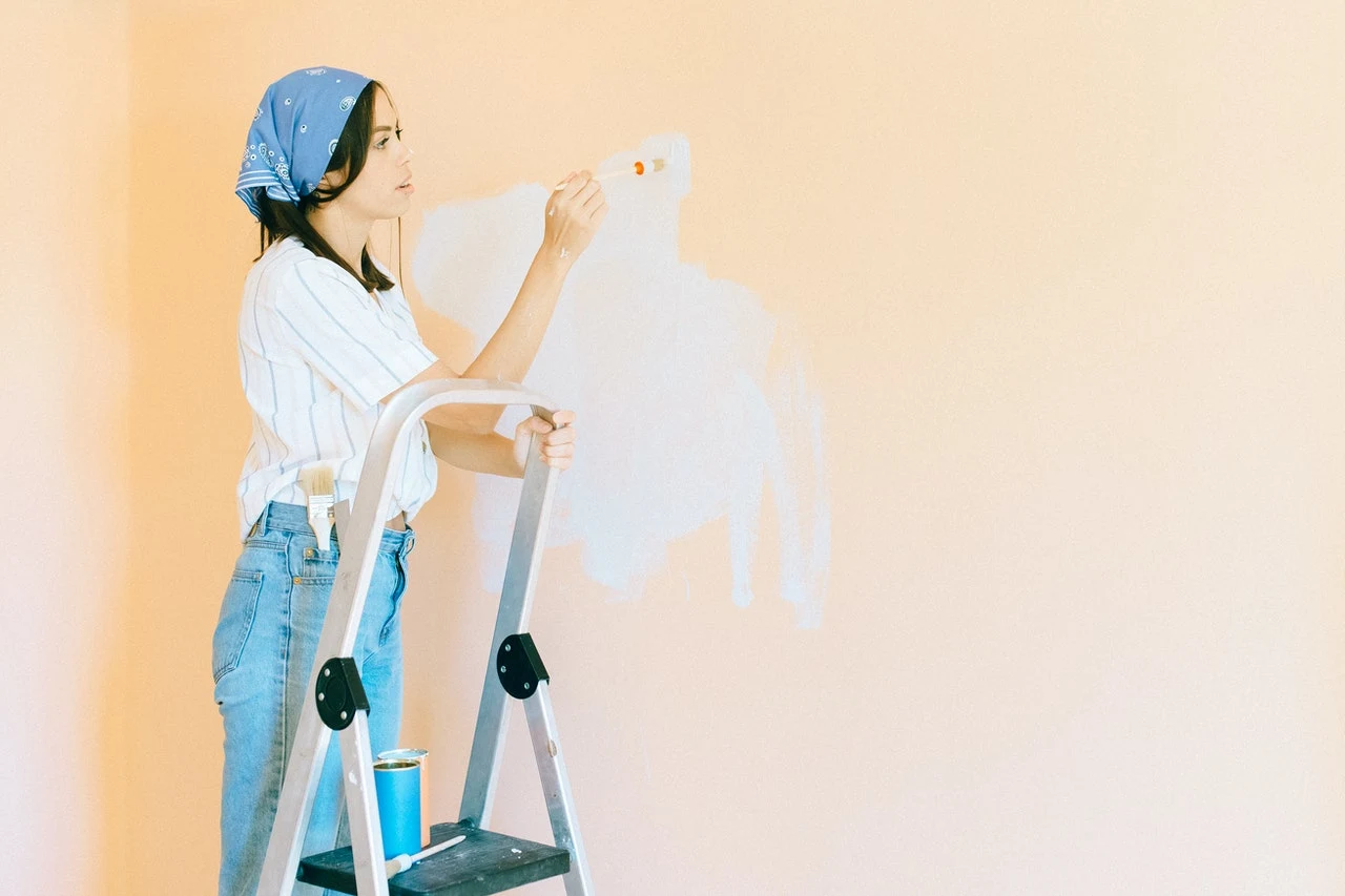
| Painting the Wall with White color enlarges our sensation, Photo by Nataliya Vaitkevich from Pexels. |
Color is an integral part of the visual experience and can affect our lives in a variety of ways. Color is one of the most powerful design tools available for architects and designers to use when it comes to implementing a specific influence on viewers.
For instance, a study showed that blue rooms put people to sleep faster than any other color. But this same color can be used to increase learning in schools by putting students in blue rooms. Other research also recommended the pink color for less stress and to make aggressive people calmer, which is the perfect color for painting the prison’s walls.
Colors in Architecture
In addition, color psychology is a powerful art. It’s the secret ingredient that turns a tasteless, boring house into a welcoming home, where many homeowners don’t realize that the colors they choose for their homes can affect their mood and overall happiness.
Here are some tips to help you choose the right colors for your home:
Today, it is normal to see color in architecture, and it has been for quite some time. Color is used in many ways and can be very effective in creating an emotional response. While there are many ways to use color effectively in architecture, one of the most important aspects to consider is the way that color affects your emotions.
In general, it is believed that warm colors will make you feel safe and calm, while cool colors will make you feel energetic or active. It’s always a good idea to create a mood board when designing a room and to choose colors based on how they will affect the functionality of this space.
Therefore, COLOR IS A POWERFUL TOOL WHEN YOU ARE DESIGNING YOUR SPACE. IT CAN AFFECT MOOD, STRESS LEVELS, AND EVEN PRODUCTIVITY.
The next section will focus on the psychology behind colors in architecture and how best to use them to get the results you want.
Colors that work well together!
Your Color Palette is a very important tool in design, no matter the medium or the domain in which you are designing. It can communicate a mood, create a sense of place or time, or simply draw attention to an important element in your design.
 |
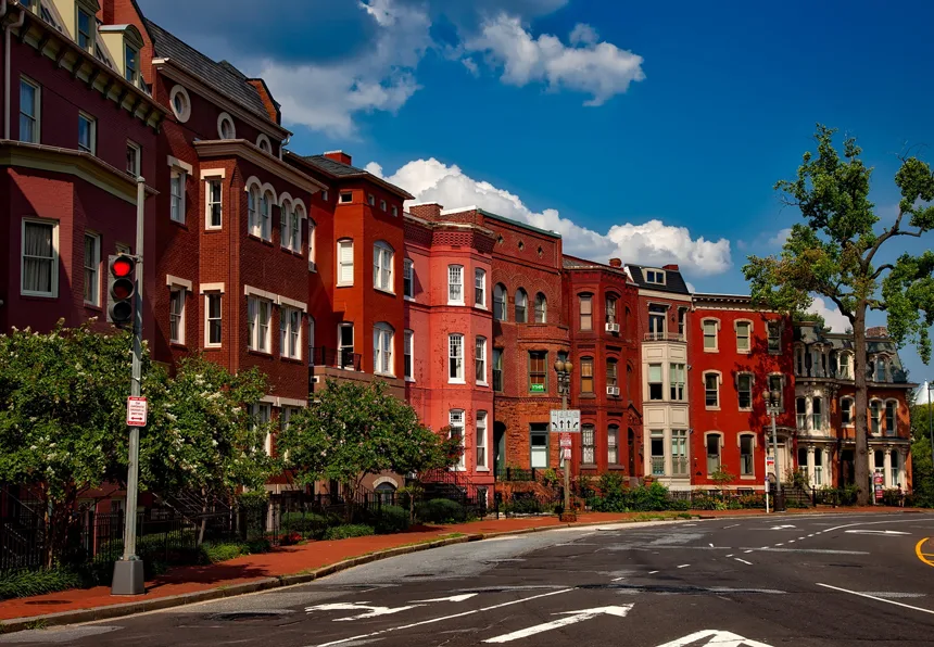
| Urban houses with associated colors in Washington, DC, United States. Photo from Pikist.com |
There are many different ways to select colors that work well together; here are some of the best methods I’ve found. Let us take the web design as a reference for our comparison study; An eye-catching color scheme is incredibly important when designing a website, for example.
 |
| The Color Wheel of Newton, Photo by: printrunner.com |
When done right, color schemes can draw attention to certain elements, help the user easily understand the overall message of your site, and stimulate the senses. The use of complementary colors is one of the most effective ways to create a pleasing visual balance on a page, and it can also be used to direct the user’s attention toward specific areas of the design. Complementary colors are opposite each other on the color wheel. (See the Figure aside)
A lot of times, when people pair complementary colors, they tend toward using one light color with one dark. The psychology of color influences the way consumers perceive products.
Companies use colors to target potential customers and evoke emotion. Every single business has a unique target market with different regional demographics, so it’s essential to choose colors that will appeal to your target audience.
The same strategy of colors can be applied to the architecture of buildings.
- For example, the different regional demographics can be referred to as the favorite color of every region or community, according to the country where your design is taking place.
- As well, the complementary colors can be treated as the secondary architectural elements within a specific project. The relevant sample can be multiple recessed balconies, emerging from a solid vertical element that owns its unique color too...
- And so on, the examples are very varied here.
And we continue our previous sample of comparing an architectural project to a website's design, and how we can choose the colors that work together. Here are a few of the most popular color schemes for our evaluation:
- Red and White/Blue – Red is the color of anger, passion, love, and danger. White or blue is associated with purity, cleanliness, and trustworthiness. Combining these two colors makes people feel safe and comfortable while they shop online. Similarly, it is the most preferred color in religious edifices (i.e., mosques and churches) where it symbolizes purity and faith towards God, as for its architectural usage.
- The Blue. Colors can be complicated to use in architecture, especially if you are trying to convince the client that your design is the best. When choosing paint colors for a room, it is important to consider the mood and feelings that you want to create. Is it a place for relaxing or entertaining? Do you want to make it look bigger? Do you want something that goes with the decor of the room? These are all questions that will help determine what color you should use on the walls of your project.
How To Choose The Proper Colors For Your Project
To help you get started, here are some useful tips on how to choose paint colors for walls and ceilings: Every architect has the same problem — how to create a building that will be remembered. A good design can make all the difference, and it is not about the budget you spend; it is all about a few tips on what colors, materials, and shapes to use to get that memorable building you have always wanted!
 |
| Choosing the right color can be a hard task, according to the client's taste. Photo by Ketut Subiyanto from Pexels |
With all the different color combinations, it can be hard to know what colors work well together. The color wheel is a commonly used tool to understand what colors work well together and which ones clash.
Color wheels were created by Sir Isaac Newton in 1666 and are based on his studies of light. They use a circular layout to organize different hues into hue families. As you move around the wheel, you go through all the different “colors” or hues created by the mixture of those colors together. (See figure above for the Color Wheel of Newton)
To conclude, colors are a great way to make a statement, whether you want your home to be more calming or more vibrant. A high-quality paint job can add thousands of dollars of value to your home.
Many colors work well together, while others don’t, but it is important to understand the characteristics of each color. The designer must be aware when using colors that are contrasting, warm, or cool, and how they affect human behavior.
This article has given you some helpful tips on how to create the best combinations for your next project. We hope we were able to explain what works best when designing with color! If there is a topic missing or you want more info about it, please let us know in the comments section below.
.png)


